SCRIPT
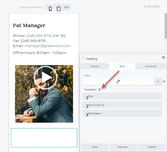
In the page builder, select a module. This could theoretically be one of a number of modules but a heading module will do for now. In the style menu, click on the small desktop icon. This opens the Responsive Editing menu.
Responsive Editing allows the user to edit the mobile view of the site. When on the mobile view, the small desktop icon will be replaced with a mobile icon. Clicking that icon or clicking “exit” on the menu above will bring back the normal desktop editing mode.
When making edits in the Responsive Editing mode, all edits made on an option or field which has a desktop or mobile icon next to it are unique to the device mode you are currently on. All other changes are not unique to that mode. For instance, I can edit anything in the “Typography” menu on the mobile mode and have the desktop mode remain the same, but, if I edit the color or heading text, it will change across modes.