VIDEO
SCRIPT
The standard button is the basis for all button modules in Civic Clarity. It can display text and an icon. The user can also set the link and customize the button’s color. Using color presets, as discussed in our video about that, to set the button color, is advisable.
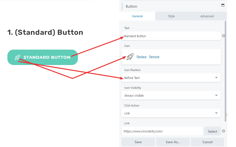
The text field is where custom text can be entered to be displayed on the button.
The “select icon” button opens up the icons menu. Use the search function to find the icon you want, then click on it.
“Icon Position” simply places the icon in relation to the text on the button.
The “Link” field is where a custom link can be entered, which is accessed by clicking on the button on the live website.
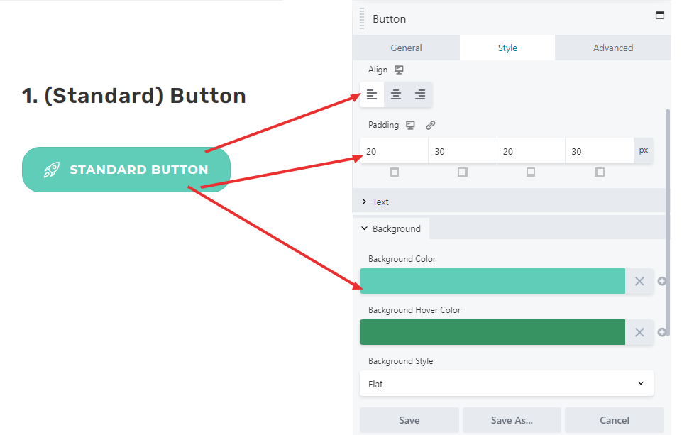
The style menu allows for the look of the button to be customized.
The “text” menu contains the standard text options, very similar to the heading module.
The “background” menu allows customizing the background color of the button. It is recommended to change the Background Color and Background Hover Color according to color presets.
While the background style can be changed to “gradient” through this module, this can be done better through a different module, the Power Smart Button.
SCREEN SHOTS
GENERAL TAB
STYLE TAB