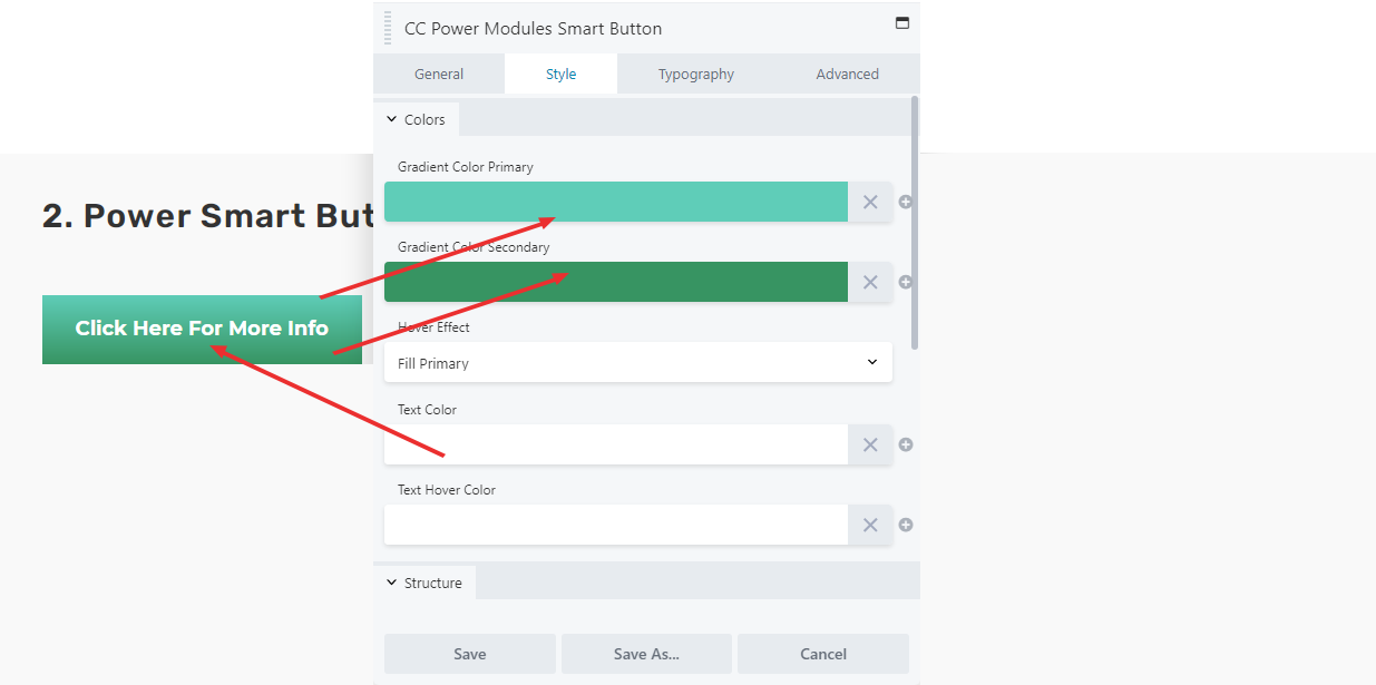
This buttons allows you to create gradients that flip, fill in, zoom in/out, etc. Below is an example of the button filling in the top color when hovered. It is the only button that has a gradient that will fill to one color when hovered over.
VIDEO
SCRIPT
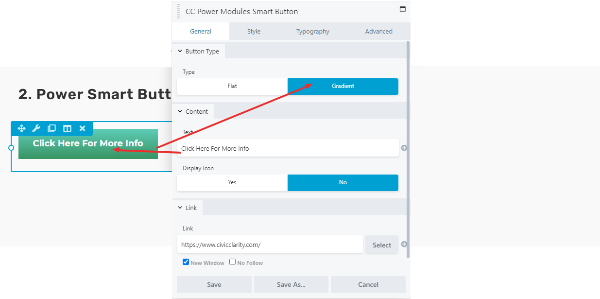
The Smart Button is a button module highly similar to the standard button module. It can do all the same things that the Standard Button does, and a little more. The use of this button is recommended if the user wants a gradient background for their button.
In the General tab, set the “Button type” to Gradient.
In the style menu, set the primary color (which will be the top of the button) and the secondary color (which will be the bottom of the color) and the hover effect.
The rest of the style menu functions identically to the standard button.
SCREEN SHOTS
GENERAL TAB
STYLE TAB
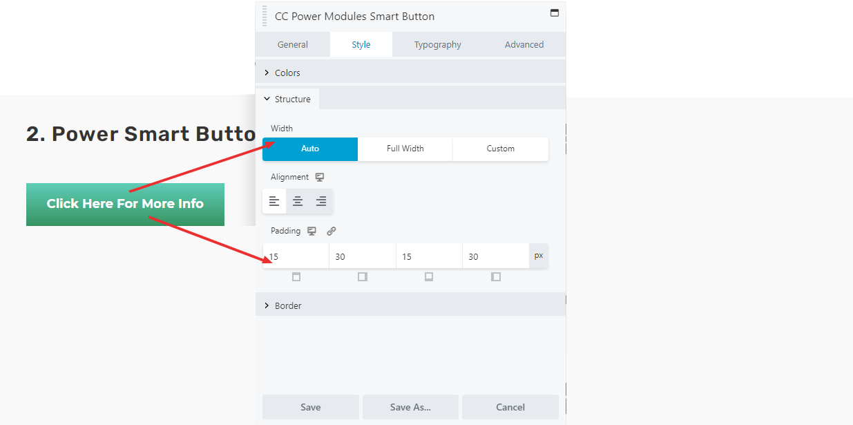
Padding is the space above and below and to the left and right of the words of the button.