Each side of this button links to a different URL. The buttons can be separate, or can be joined with some text or icons. It has only one generic gradient option.
VIDEO
SCRIPT
The Ultra Dual Button Module is yet another iteration on the Button Module. The main difference between the Ultra Dual Button and the Standard Button is that two buttons and a divider are included in the same module. It could be used if a civic organization wanted to give the option for Pay Online or Mail the check. Then Pay Online could direct to a pay location, while Mail could go to a page that has the organization’s mailing address.
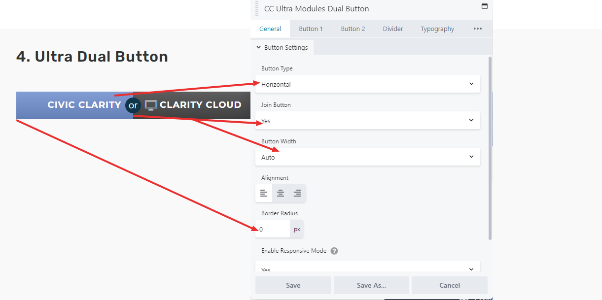
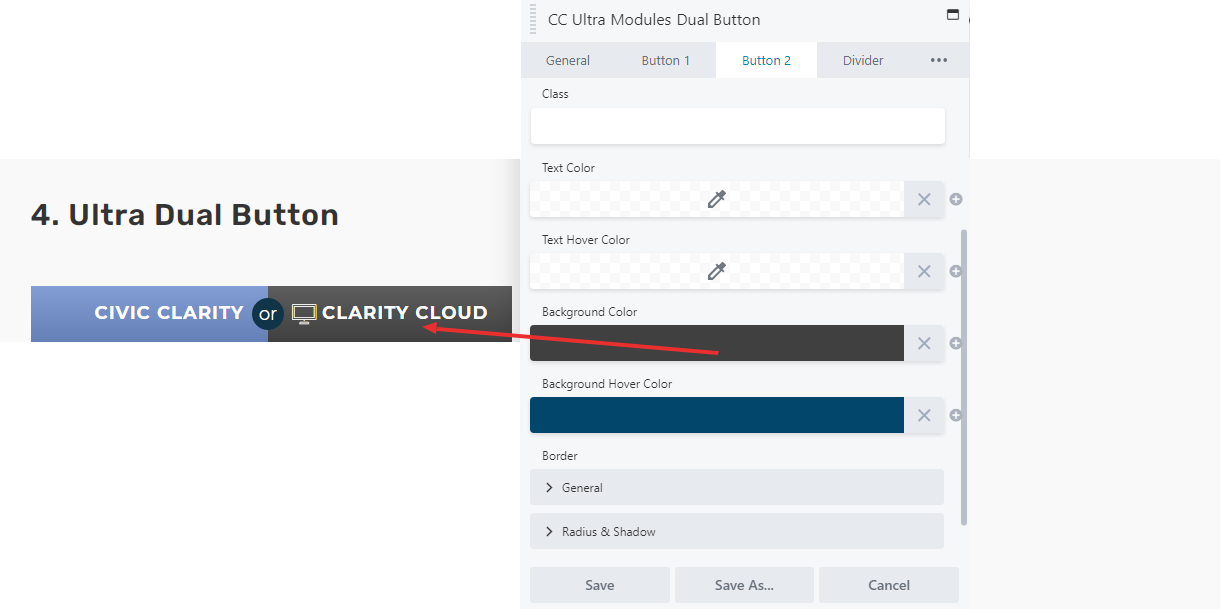
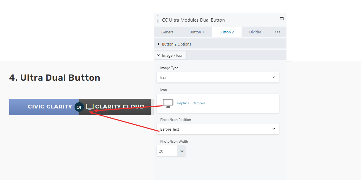
The general tab contains the “Button type” menu, which allows the user to set the buttons as either horizontal or vertical. The “Button Style:” be it flat, gradient, or transparent, is also set on the General Tab. This will apply to both buttons, for sake of graphical coherency. The two buttons have their own tabs and function identically to the standard button themselves.
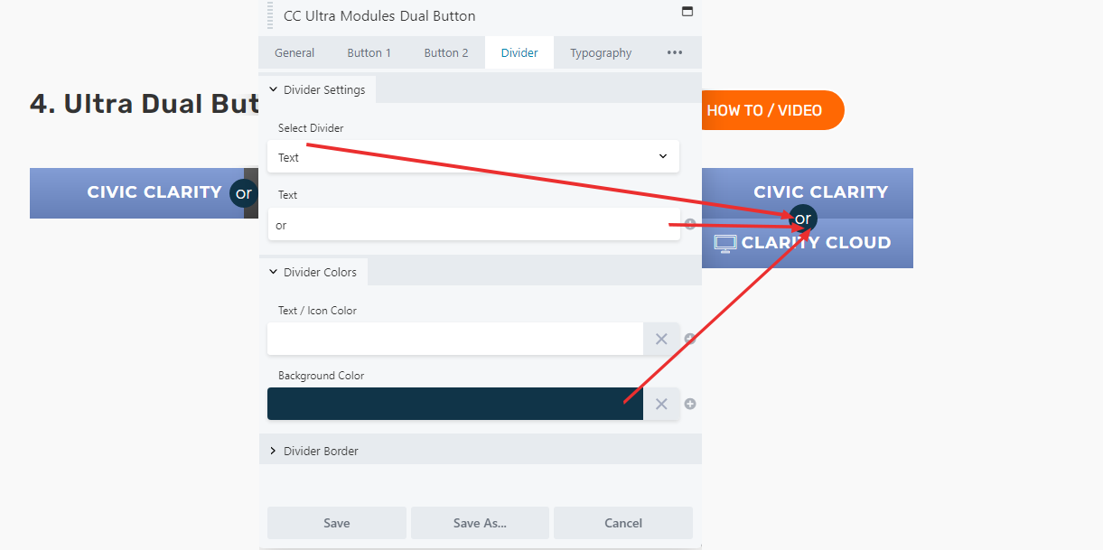
The Divider is an optional addition to the module, which is placed between the two buttons. It is currently set to text; it can be text, OR an icon from the icons menu, OR an image from the Media Library. Please note that any images chosen will be scaled down significantly to match the size of the divider.
The size of the divider cannot be adjusted.
SCREEN SHOT
It can be designed horizontally and vertically. It has many hover options as well.
GENERAL TAB
BUTTON 2
DIVIDER TAB
Not shown is that you can change the shape of the divider in the Divider Border section. This section only allows for 3 characters/letters.